import pandas as pd
import numpy as np
import folium
from branca.colormap import LinearColormap
import matplotlib.pyplot as plt
import matplotlib.image as mpimgVisualising the Geographic Distribution of Charity Donors with Interactive Leaflet Maps
Python
EH
An anonymised display of voluntary work conducted for Emmanuel House Support Centre. Post 2/5 in the series.
Data Imports
FakeIndividualConstituents.csv is a dataset I constructed consisting of the donation details of 100 fictional donors to a charity in Nottingham.
This post is meant to illustrate my method for investigating the distribution of donors to a real charity at which I volunteer - Emmanuel House in Nottingham.
Newsletter is a binary feature labelling if the donor is subscribed to the charity’s newsletter.
df = pd.read_csv('files/FakeIndividualConstituents.csv')
df.head()| Postcode | NumberDonations | TotalDonated | AverageDonated | Newsletter | |
|---|---|---|---|---|---|
| 0 | NG9 3WF | 4 | 61 | 15.25 | 1 |
| 1 | NG9 4WP | 1 | 23 | 23.00 | 0 |
| 2 | NG9 3EL | 1 | 30 | 30.00 | 0 |
| 3 | NG1 9FH | 5 | 75 | 15.00 | 1 |
| 4 | NG5 6QZ | 1 | 15 | 15.00 | 0 |
df[5:].sample(5)| Postcode | NumberDonations | TotalDonated | AverageDonated | Newsletter | |
|---|---|---|---|---|---|
| 64 | NG8 3HT | 9 | 153 | 17.00 | 1 |
| 98 | NG3 1FF | 3 | 56 | 18.67 | 1 |
| 12 | NG1 3RD | 1 | 15 | 15.00 | 0 |
| 54 | NG5 3FD | 3 | 48 | 16.00 | 1 |
| 9 | NG9 4AX | 1 | 17 | 17.00 | 0 |
df.info()<class 'pandas.core.frame.DataFrame'>
RangeIndex: 100 entries, 0 to 99
Data columns (total 5 columns):
# Column Non-Null Count Dtype
--- ------ -------------- -----
0 Postcode 100 non-null object
1 NumberDonations 100 non-null int64
2 TotalDonated 100 non-null int64
3 AverageDonated 100 non-null float64
4 Newsletter 100 non-null int64
dtypes: float64(1), int64(3), object(1)
memory usage: 4.0+ KBdf.describe()| NumberDonations | TotalDonated | AverageDonated | Newsletter | |
|---|---|---|---|---|
| count | 100.000000 | 100.000000 | 100.00000 | 100.000000 |
| mean | 4.320000 | 250.150000 | 46.51950 | 0.500000 |
| std | 5.454828 | 1657.135245 | 212.23961 | 0.502519 |
| min | 1.000000 | 15.000000 | 15.00000 | 0.000000 |
| 25% | 1.000000 | 30.000000 | 15.00000 | 0.000000 |
| 50% | 2.000000 | 45.000000 | 15.19000 | 0.500000 |
| 75% | 5.000000 | 92.000000 | 16.92500 | 1.000000 |
| max | 37.000000 | 16618.000000 | 2077.25000 | 1.000000 |
Geocoding Postcodes with ONS data
For the details of this geocoding process, see my previous blog post:
Geocoding Postcodes in Python: pgeocode v ONS
post = pd.read_csv(r'C:\Users\Daniel\Downloads\open_postcode_geo.csv\open_postcode_geo.csv', header=None)
post = post[[0, 7, 8]]
post = post.rename({0: 'Postcode', 7: 'Latitude', 8: 'Longitude'}, axis=1)

df = df.merge(post, on='Postcode', how='left')

df.head()| Postcode | NumberDonations | TotalDonated | AverageDonated | Newsletter | Latitude | Longitude | |
|---|---|---|---|---|---|---|---|
| 0 | NG9 3WF | 4 | 61 | 15.25 | 1 | 52.930121 | -1.198353 |
| 1 | NG9 4WP | 1 | 23 | 23.00 | 0 | 52.921587 | -1.247504 |
| 2 | NG9 3EL | 1 | 30 | 30.00 | 0 | 52.938985 | -1.239510 |
| 3 | NG1 9FH | 5 | 75 | 15.00 | 1 | 52.955008 | -1.141045 |
| 4 | NG5 6QZ | 1 | 15 | 15.00 | 0 | 52.996670 | -1.106307 |
Visualising Donor Data with Interactive Folium Maps
Folium is a Python library providing the functionality to visualise data in the form of interactive leaflet (.html) maps.
First Map
Producing a basic folium map with no extra features:
m = folium.Map(location=[52.9548, -1.1581], zoom_start=12)

for index, row in df.iterrows():

    folium.CircleMarker(
        location=[row['Latitude'], row['Longitude']],
        radius=5,
        color='blue',
        fill=True,
        fill_color='blue',
        fill_opacity=0.7,
    ).add_to(m)

m.save('FakeDonorMap1.html')
m
Make this Notebook Trusted to load map: File -> Trust Notebook
Adding Colour Labelling
We can colour each point by the value of TotalDonated using LinearColormap from branca.colormap:
m = folium.Map(location=[52.9548, -1.1581], zoom_start=12)

colors = ['green', 'yellow', 'orange', 'red', 'purple']
linear_colormap = LinearColormap(colors=colors,
                                 index=[0, 100, 250, 500, 1000],
                                 vmin=df['TotalDonated'].min(),
                                 vmax=df['TotalDonated'].quantile(0.99025))

for index, row in df.iterrows():

    total_don = row['TotalDonated']
    color = linear_colormap(total_don)

    folium.CircleMarker(
        location=[row['Latitude'], row['Longitude']],
        radius=5,
        color=color,
        fill=True,
        fill_color=color,
        fill_opacity=1,
    ).add_to(m)

linear_colormap.add_to(m)

m.save('FakeDonorMap2.html')
m
Make this Notebook Trusted to load map: File -> Trust Notebook
Adding Pop-Ups
Next, I added a pop-up to each data point showing the user the data of that donor by adding an argument popup to folium.CircleMarker:
m = folium.Map(location=[52.9548, -1.1581], zoom_start=12)

colors = ['green', 'yellow', 'orange', 'red', 'purple']
linear_colormap = LinearColormap(colors=colors,
                                 index=[0, 100, 250, 500, 1000],
                                 vmin=df['TotalDonated'].min(),
                                 vmax=df['TotalDonated'].quantile(0.99025))

for index, row in df.iterrows():
    num_don = row['NumberDonations']
    total_don = row['TotalDonated']
    news = bool(row['Newsletter'])
    avg_don = row['AverageDonated']

    popup_text = f'<div style="width: 175px;">\
                  Total Donated: £{total_don:.2f}<br>\
                  Number of Donations: {num_don}<br>\
                  Average Donation: £{avg_don:.2f}<br>\
                  Subscribed to Newsletter: {news}\
                  </div>'

    color = linear_colormap(total_don)

    folium.CircleMarker(
        location=[row['Latitude'], row['Longitude']],
        radius=5,
        color=color,
        fill=True,
        fill_color=color,
        fill_opacity=1,
        popup=popup_text
    ).add_to(m)

linear_colormap.add_to(m)

m.save('FakeDonorMap_noLayerControl.html')
m
Make this Notebook Trusted to load map: File -> Trust Notebook
Showing a screenshot taken with ShareX using Matplotlib:
plt.figure(figsize=(20,10))
img = mpimg.imread('FakeDonorMap_noLayerControl.jpg')
imgplot = plt.imshow(img)
plt.show()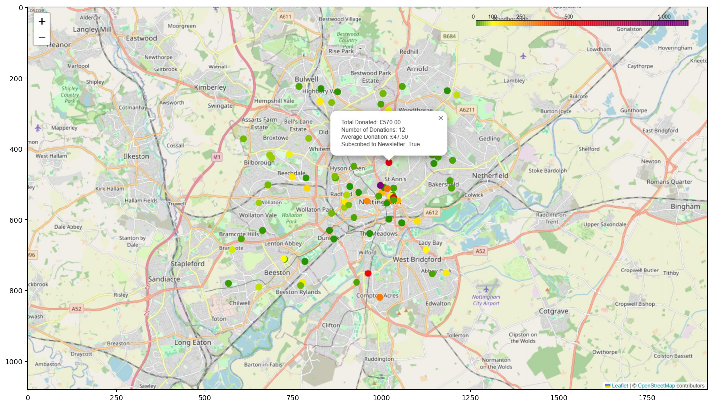
Adding Layer Control
Finally, I added layer control to the map using folium.map.FeatureGroup and folium.LayerControl.
This results in buttons being added to the right of the UI, under the colour bar, allowing the user to show/hide the markers for donors in specific ranges of donation totals.
I used Microsoft Copilot to assist with this step.
m = folium.Map(location=[52.9548, -1.1581], zoom_start=12)

colors = ['green', 'yellow', 'orange', 'red', 'purple']
linear_colormap = LinearColormap(colors=colors,
                                 index=[0, 100, 250, 500, 1000],
                                 vmin=df['TotalDonated'].min(),
                                 vmax=df['TotalDonated'].quantile(0.99025))

# Create FeatureGroups
fgroups = [folium.map.FeatureGroup(name=f"Total Donated:  £{lower}-£{upper}") for lower, upper in zip([0, 100, 250, 500, 750, 1000], [100, 250, 500, 750, 1000, float('inf')])]

for index, row in df.iterrows():
    num_don = row['NumberDonations']
    total_don = row['TotalDonated']
    news = bool(row['Newsletter'])
    avg_don = row['AverageDonated']

    popup_text = f'<div style="width: 175px;">\
                  Total Donated: £{total_don:.2f}<br>\
                  Number of Donations: {num_don}<br>\
                  Average Donation: £{avg_don:.2f}<br>\
                  Subscribed to Newsletter: {news}\
                  </div>'

    color = linear_colormap(total_don)

    marker = folium.CircleMarker(
        location=[row['Latitude'], row['Longitude']],
        radius=5,
        color=color,
        fill=True,
        fill_color=color,
        fill_opacity=1,
        popup=popup_text
    )

    # Add the marker to the appropriate FeatureGroup
    for fgroup, (lower, upper) in zip(fgroups, zip([0, 100, 250, 500, 750, 1000], [100, 250, 500, 750, 1000, float('inf')])):
        if lower <= total_don < upper:
            fgroup.add_child(marker)
            break

# Add the FeatureGroups to the map
for fgroup in fgroups:
    m.add_child(fgroup)

linear_colormap.add_to(m)
m.add_child(folium.LayerControl())


m.save('FakeDonorMap_withLayerControl.html')
m
Make this Notebook Trusted to load map: File -> Trust Notebook
Showing a screenshot taken with ShareX using Matplotlib:
plt.figure(figsize=(20,10))
img = mpimg.imread('FakeDonorMap_withLayerControl.jpg')
imgplot = plt.imshow(img)
plt.show()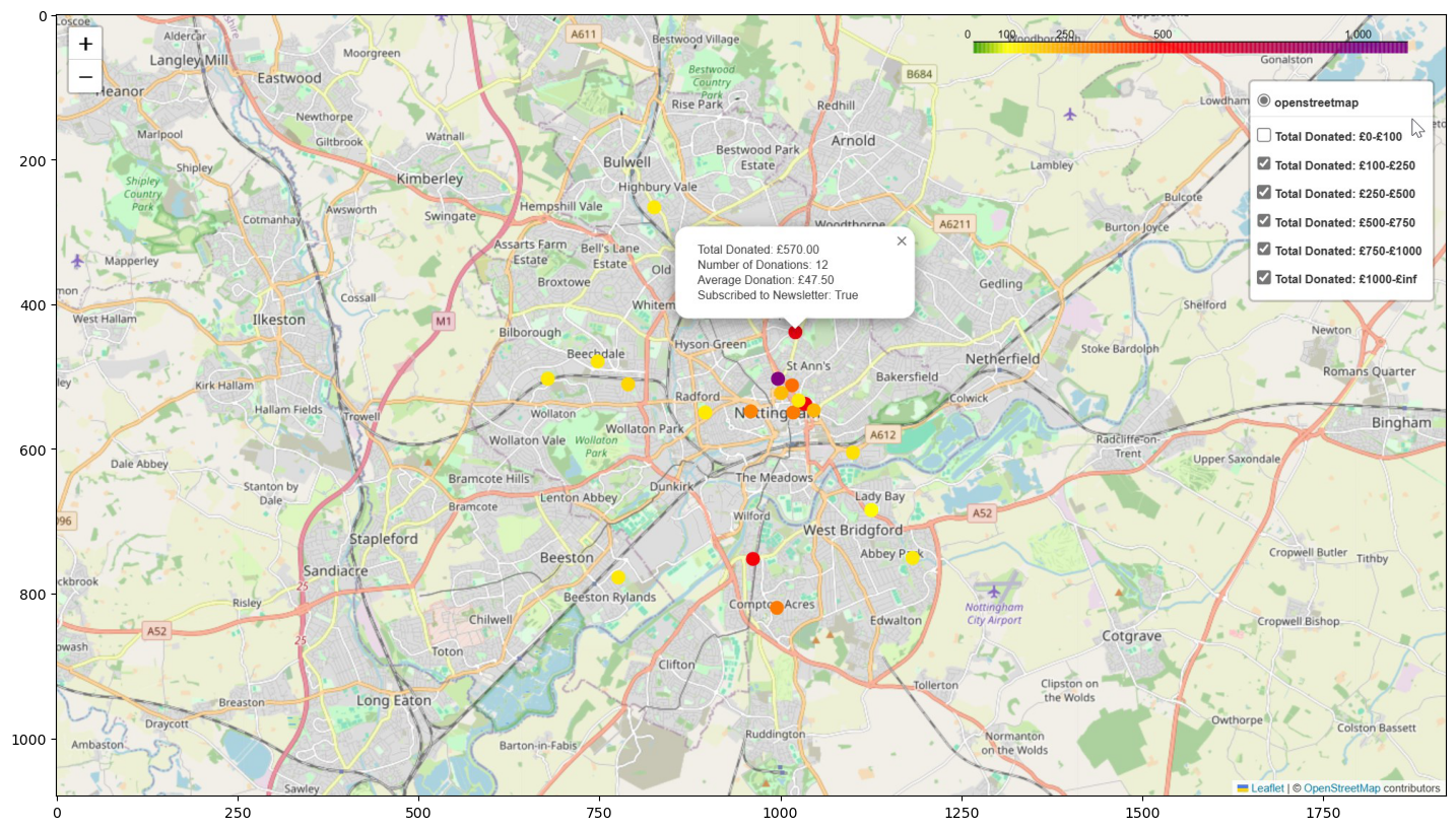
Constructing the Fake Data
I started with nottm_postcodes.csv, the csv file of 100 random Nottingham postcodes I used in my previous post:
Geocoding Postcodes in Python: pgeocode v ONS
df = pd.read_csv('files/nottm_postcodes.csv')
df.head()| Postcode | |
|---|---|
| 0 | NG9 3WF |
| 1 | NG9 4WP |
| 2 | NG9 3EL |
| 3 | NG1 9FH |
| 4 | NG5 6QZ |
I then defined NumberDonations using a standard normal distribution via np.random.randn, adding 1 using Python broadcasting to ensure each donor has donated at least one time.
I initially tried to produce the number of donations by uniformly generating a random integer between 1 and 40. However, this resulted in a mean number of donations of ~20 which was not at all representative of the real data.
Raising 5 to the power of the standard normal random variable generated by np.random.randn and adding 1 resulted in a NumberDonations column with a more realistic distribution.
num_donations = 1 + np.round(5**np.random.randn(100))
df['NumberDonations'] = pd.Series(num_donations).astype(int)
df['NumberDonations'].describe()
count 100.000000
mean 3.920000
std 5.104326
min 1.000000
25% 1.000000
50% 2.000000
75% 3.250000
max 34.000000
Name: NumberDonations, dtype: float64I wanted the TotalDonated column to postively correlate with the NumberDonations column but not be entirely determined by it.
I settled on the approach of multiplying the NumberDonations column by 15 and adding to this 20 raised to the power of another standard normal random variable. Including the second normal random variable adds random noise to this TotalDonated column, meaning it isn’t entirely determined by NumberDonations.
The distribution of TotalDonated is not at all perfect, but suffices for the purposes of this post.
total_donated = np.round(np.abs(15*num_donations + 20**np.random.randn(100)))
df['TotalDonated'] = pd.Series(total_donated).astype(int)
df['TotalDonated'].describe()
count 100.000000
mean 69.340000
std 86.320196
min 15.000000
25% 30.000000
50% 33.000000
75% 61.500000
max 512.000000
Name: TotalDonated, dtype: float64df.corr(numeric_only=True)| NumberDonations | TotalDonated | |
|---|---|---|
| NumberDonations | 1.000000 | 0.916614 |
| TotalDonated | 0.916614 | 1.000000 |
The AverageDonated column is simply TotalDonated divided by NumberDonations
df['AverageDonated'] = np.round(df['TotalDonated']/df['NumberDonations'], decimals=2)
df['AverageDonated'].describe()
count 100.000000
mean 19.372000
std 16.543806
min 15.000000
25% 15.000000
50% 15.070000
75% 16.425000
max 164.500000
Name: AverageDonated, dtype: float64My first approach to generating the binary feature Newsletter was:
newsletter = (np.random.rand(100) > 0.5).astype(int)
df['Newsletter'] = pd.Series(newsletter)
df['Newsletter'].describe()
count 100.00
mean 0.55
std 0.50
min 0.00
25% 0.00
50% 1.00
75% 1.00
max 1.00
Name: Newsletter, dtype: float64However I wanted the binary Newsletter feature to positively correlate with TotalDonated but again not be entirely determined by it. The approach above results in an entirely randomly chosen Newsletter with 0 correlation to TotalDonated.
df.corr(numeric_only=True)| NumberDonations | TotalDonated | AverageDonated | Newsletter | |
|---|---|---|---|---|
| NumberDonations | 1.000000 | 0.916614 | -0.078951 | 0.112402 |
| TotalDonated | 0.916614 | 1.000000 | 0.297428 | 0.061388 |
| AverageDonated | -0.078951 | 0.297428 | 1.000000 | -0.119316 |
| Newsletter | 0.112402 | 0.061388 | -0.119316 | 1.000000 |
Upon the suggestion of Copilot I settled on the following:
def add_newsletter(df):
    # Create a score that is a combination of 'NumberDonations' and 'TotalDonated'
    score = df['NumberDonations'] + df['TotalDonated'] + df['NumberDonations'] * df['TotalDonated']

    # Add some random noise to 'Score'
    score += np.random.normal(0, 0.1, df.shape[0])

    # Create 'Newsletter' column by thresholding 'Score' such that the mean of 'Newsletter' is about 0.5
    threshold = np.percentile(score, 50)  # 50 percentile, i.e., median
    df['Newsletter'] = (score > threshold).astype(int)

    return df
df = add_newsletter(df)
df['Newsletter'].describe()count 100.000000
mean 0.500000
std 0.502519
min 0.000000
25% 0.000000
50% 0.500000
75% 1.000000
max 1.000000
Name: Newsletter, dtype: float64df.corr(numeric_only=True)| NumberDonations | TotalDonated | AverageDonated | Newsletter | |
|---|---|---|---|---|
| NumberDonations | 1.000000 | 0.916614 | -0.078951 | 0.472558 |
| TotalDonated | 0.916614 | 1.000000 | 0.297428 | 0.525571 |
| AverageDonated | -0.078951 | 0.297428 | 1.000000 | 0.186624 |
| Newsletter | 0.472558 | 0.525571 | 0.186624 | 1.000000 |
Thus we arrive at the synthetic dataset. Note that this is not exactly the same as the one used above due to the random nature of the generation process.
df.head()| Postcode | NumberDonations | TotalDonated | AverageDonated | Newsletter | |
|---|---|---|---|---|---|
| 0 | NG9 3WF | 21 | 399 | 19.00 | 1 |
| 1 | NG9 4WP | 1 | 16 | 16.00 | 0 |
| 2 | NG9 3EL | 16 | 241 | 15.06 | 1 |
| 3 | NG1 9FH | 2 | 30 | 15.00 | 0 |
| 4 | NG5 6QZ | 1 | 15 | 15.00 | 0 |
df.sample(5)| Postcode | NumberDonations | TotalDonated | AverageDonated | Newsletter | |
|---|---|---|---|---|---|
| 11 | NG13 8XS | 2 | 30 | 15.00 | 0 |
| 9 | NG9 4AX | 1 | 17 | 17.00 | 0 |
| 52 | NG2 6QB | 1 | 19 | 19.00 | 0 |
| 34 | NG1 1LF | 3 | 85 | 28.33 | 1 |
| 85 | NG7 5QX | 1 | 15 | 15.00 | 0 |
df.describe()| NumberDonations | TotalDonated | AverageDonated | Newsletter | |
|---|---|---|---|---|
| count | 100.000000 | 100.000000 | 100.000000 | 100.000000 |
| mean | 3.920000 | 69.340000 | 19.372000 | 0.500000 |
| std | 5.104326 | 86.320196 | 16.543806 | 0.502519 |
| min | 1.000000 | 15.000000 | 15.000000 | 0.000000 |
| 25% | 1.000000 | 30.000000 | 15.000000 | 0.000000 |
| 50% | 2.000000 | 33.000000 | 15.070000 | 0.500000 |
| 75% | 3.250000 | 61.500000 | 16.425000 | 1.000000 |
| max | 34.000000 | 512.000000 | 164.500000 | 1.000000 |
Remarks and Further Directions
The postcodes were randomly chosen from a certain latitude and longitude range encompassing Nottingham city. Thus there is no significance to the geographic distribution of the fake donors, while for the real data there were many interesting patterns to be investigated. For example, there is in fact a relationship between donor density and the social deprivation of areas of Nottingham not reflected in the synthetic data.
Similarly, the number of donations for the fake dataset was randomly generated and the total donated was generated from the number of donations plus some transformed gaussian noise. In practice there is a relationship between the amount given by donors and where in Nottingham they live.
I would be interested to investigate if I could find a way to make the fake dataset more accurately reflect the distribution of the true donor dataset without breaching any GDPR rules.
I have ideas of attaching statistics to the dataset, including population density, median income, IMD (Index of Multiple Deprivation) etc. I am currently invesigating this and it may be the topic of future blog posts.
Ultimately I want to train ML models on the donor dataset for the purposes of predictive modelling. I have tried some simple regression approaches, but want to conduct some more feature engineering on the dataset before prioritising this.